Your Website, Your Rules: Why Wix, Squarespace, GoDaddy’s Web Builder, and Other Website Builders Might Not Be the Best Fit for You

Your Website, Your Rules: Why Wix, Squarespace, GoDaddy’s Web Builder, and Other Website Builders Might Not Be the Best Fit for You

Crop unrecognizable man choosing photos and working on laptop

Hey there, fellow web enthusiasts! In the world of DIY website building, platforms like Wix, Squarespace, and GoDaddy’s Web Builder have become the go-to pals for many. But hold up – before you dive headfirst into the convenience pool, let’s have a friendly chat about why these platforms might not be the perfect partners for your website-building journey.

  1. Your Website, Your Style:
    Imagine you’re throwing a party, and everyone shows up wearing the same outfit. Not the vibe you’re going for, right? Well, that’s a bit like what happens with website builders. They offer templates, but sometimes your website might end up looking a tad too similar to others. Customization is key, and these platforms might cramp your style when it comes to creating a unique online home.
  2. Brand Identity – Let It Shine:
    Your brand is like the superhero cape of your website – it makes you stand out in the digital crowd. Unfortunately, website builders might not be the best sidekicks for showcasing your brand’s uniqueness. Customization options may not be robust enough to let your brand personality shine through, leaving your website feeling a bit like a cookie-cutter creation.
  3. SEO: More Than Just Three Letters:
    Ah, the mysterious world of SEO – Search Engine Optimization. If you want your website to be the superhero that gets noticed, you’ll need a solid SEO strategy. Here’s the hitch – website builders might not be the best mentors for your SEO journey. Limited customization can impact your ability to optimize crucial elements, potentially leaving your website stranded on the outskirts of search engine results.
  4. Who Holds the Reins? Ownership Matters:
    Picture this: you throw a fantastic party at someone else’s house, but you can’t control the guest list or the playlist. Not so fun, right? Well, with website builders, you might face a similar lack of control. These platforms come with terms and conditions that might limit your ownership and control over your own website. It’s your website – shouldn’t you be the one calling the shots?
  5. Speed – The Need for Quick Loading:
    We all love a speedy website, right? Picture opening a site, and it takes ages to load – not ideal. Website builders might not be the speed demons you’re looking for. The code they generate might not be as optimized as it could be, leading to slower loading times. And let’s face it, in the fast-paced online world, nobody likes to wait – not even for the coolest website.

Conclusion:
While website builders offer a quick fix, they might not be the ideal companions for your unique website-building adventure. Your website should be as special as you are – customizable, brand-focused, SEO-savvy, and under your complete control. So, before you embark on your digital journey, think about whether you want a website that’s just okay or one that truly reflects the awesome uniqueness that is you. Cheers to building something extraordinary!

Unveiling the Secrets to Snagging the Perfect Domain Name for Your Business

Unveiling the Secrets to Snagging the Perfect Domain Name for Your Business

So, you’ve got this brilliant business idea, but now you need the online real estate to make it official. The first step? Picking a killer domain name. It’s not just an address; it’s your brand’s digital identity. Choosing one isn’t just pulling phrases out of a hat; it’s a strategic move. Here’s how to nail it:

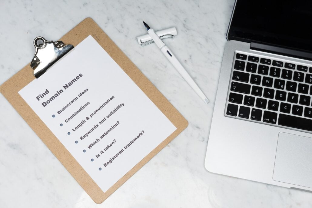
white printer paper beside silver macbook

1. Keep it Short, Sweet, and Simple
Length matters, folks! Shorter names are easier to remember and type. Imagine yourself typing “ilovemagicalunicornstoys.com” every time. Exhausting, right? Opt for brevity and clarity.

2. Easy as ABC (Alphabets, that is)
Ponder over spelling. Go for words that are easy to spell and avoid tricky homophones. You don’t want people ending up on a completely different site just because they spelled your domain wrong.

3. Be .Committed
While creative domain extensions exist (.tech, .guru, .ninja), sticking with the classic “.com” is generally your best bet. It’s what people default to when typing in a web address.

4. Keywords: Friends or Foes?
In the good ol’ days, jamming your domain with keywords could boost your SEO. But now? Meh. Sure, it’s nice if it fits, but don’t force it. The user experience reigns supreme.

5. Unique is the New Cool
Standing out in a sea of websites is the name of the game. Make your domain name unique—think outside the box without wandering into Confusionville.

6. Future-Proof Your Name
Picture your business in 5 years. Will your domain name still make sense if you expand your offerings or shift your focus? Plan for growth, buddy!

7. Say No to Hyphens and Numbers
Hyphens? Numbers? Say “adios.” They make things awkward when telling someone your domain name aloud. “Is that ‘5’ or ‘five’?” Avoid the headache.

8. Protect Your Brand
Securing social media handles that match your domain is a smart move. Consistency across platforms strengthens your brand.

9. Do Your Homework
Before committing, do a quick search. Make sure the name isn’t trademarked or copyrighted. You don’t want legal hounds nipping at your heels.

10. Test the Waters
Run it by your friends, family, the neighbor’s cat—get feedback. What’s clear to you might be gibberish to someone else.

Conclusion
Selecting a domain name is no walk in the park, but it’s a crucial piece of the online puzzle. Your domain is the welcome mat to your business—it’s the first impression. So take the time to find a name that represents your brand and resonates with your audience.

Take a breather, sip your coffee, and brainstorm. The perfect name might not hit you in a lightning bolt of inspiration, but with a bit of creativity and these tips, you’ll land a domain name that’s as catchy as your business deserves.

Why Selecting the Right Images is Important to Your Website’s Success

Why Selecting the Right Images is Important to Your Website’s Success

Silver Imac Displaying Collage Photos

Alright, folks! Let’s talk about why it’s absolutely crucial to use relevant images on your website.

Trust me, it’s a game-changer! We all know how important it is to grab people’s attention in this fast-paced digital world. Well, relevant images do just that. They not only make your site look awesome but also help convey your message and engage your visitors. Here’s why you should be all about those relevant images:

Visual Appeal That Packs a Punch

When someone lands on your website, you want to wow them, right? Relevant images are your secret weapon for making a killer first impression. They catch the eye and make your site visually appealing, drawing people in from the get-go. And let’s be real, a positive user experience can make all the difference in how your brand is perceived. So, let those images do the talking and captivate your audience!


Show, Don’t Tell

You know that saying, “A picture is worth a thousand words”? Well, it holds true, especially in the world of web design. Relevant images can convey complex ideas and information in a snap. They break down language barriers and make your content more accessible. Whether you’re showcasing products, explaining how things work, or presenting data, images are a powerful way to communicate effectively. Don’t make it complicated with walls of text when you can make it visually appealing and easy to understand!

Brand It Like a Boss

Your website is all about your brand, right? Well, relevant images are here to help you shine. They reinforce your brand’s personality, values, and uniqueness. When you choose images that align with your brand, you create a cohesive visual story that resonates with your audience. Consistency in your imagery builds recognition and helps people remember you. That’s how you build trust and loyalty!

Keep Them Glued to Your Website

Long paragraphs can be a snooze-fest, my friend. But throw in some awesome images, and you’ve got yourself a party! Relevant images break up the monotony and keep your visitors engaged. They capture attention, evoke emotions, and make people want to explore more. By creating an immersive experience, you increase the chances of visitors sticking around. And the longer they stay, the better your chances of turning them into loyal fans or customers. Now that’s what I call a win!

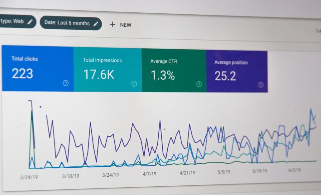
Boost Your Online Presencemonitor screengrab

Here’s a secret: search engines love relevant images too! When you use them wisely, you can boost your website’s performance in search engine results. Optimize your images with descriptive file names and alt tags, and you’ll help search engines understand what your content is all about. That means more visibility, more organic traffic, and more love from search engines. Who doesn’t want that?

Spread the Love on Social Media

In today’s social media frenzy, images are the stars of the show. They’re shareable, attention-grabbing, and can make your content go viral. So, when you sprinkle your website with relevant and visually appealing images, you increase the chances of people sharing your stuff on social media. That means more exposure, more website traffic, and potential new fans or customers. It’s like a domino effect of awesomeness!

To wrap it up

Using relevant images on your website is a total game-changer. They make your site visually appealing, help you communicate effectively, and reinforce your brand. They keep people engaged, boost your search engine visibility, and spread the love on social media. So, why wait? Start curating those awesome images and take your website to the next level. Get ready to impress and leave a lasting impression. It’s time to rock your website with relevant images!

Pin It on Pinterest